The pursuit of great B2B branding
Examples from C3.ai, Lunchbox, Squarespace, and more

Companies that brand themselves well make us feel like we know them. They earn a special place in our mind and memory.
Even with big budgets and large marketing teams, few earn this kind of meaningful connection with their audience. As marketers we create content, pay for ads to get in front prospects, have a specific set of brand colors we use. This is marketing. Branding is the how that makes for great marketing.
Branding is the combination of 1) having an it factor that makes the company look or sound unique and 2) the relentless deployment of that it factor across nearly every engagement they create with their target audience – via their website, ads, email, or social media.
Branding = Uniqueness x Consistency
It’s the visual and cultural identity of a company.
It’s the personality or personification of your company.
It’s not just the stories you tell, but the unique way you tell your stories.
It’s what makes you different from your competitors.
When you look at companies that do this well, their it factor is generally a unique exhibition and relentless deployment of one or more of these areas:
Category messaging. Think categories like CRM or marketing automation or web hosting. Every company wants to be the leader in their market category, how does their messaging reflect that.
Visual style. More than just logo and color palette. With companies that use visuals well, they could remove their logo and company name from the marketing material, but the audience would still know that the material is theirs because of the distinct design elements.
Tone of voice. Does your web copy read like it could have been written by dozens of other companies, or is it instantly recognizable as something that could only belong to your company.
Sound. Like music or an original “jingle” or even Slack’s knocking noise, is sound an after thought in your videos or ads, or can you find ways to use sound to distinguish yourself.
The companies I highlight below use these tools to make me feel like I know them even if I’m not a customer. This is impressive and important. Just like with real people, if you feel like you know a person or company then you’re more inclined to spend time with them or buy something from them.
Here’s a closer look at the branding of C3.ai, Lunchbox, Gong, Salesforce, Slack, and Squarespace.
C3.ai
The it factor: relentless use of “enterprise AI” as their category messaging
In the bay area and likely elsewhere, C3.ai constantly advertises itself as “enterprise AI” (as in artificial intelligence) on everything from billboards to radio. If you listen to KQED you know what I’m talking about.
‘What do they actually do?’ you might ask. Broadly marketing itself as “enterprise AI” is so unattached to any meaning or outcome for a potential customer that one wonders how this strategy could possibly work. Their customers don’t need artificial intelligence, they have problems that need to be solved, and sure, artificial intelligence might be a means to that end.
However, the prevalence of AI and machine learning continues to grow each year (both in utility and as popular but meaningless jargon), and it’s common enough for executives to flaunt how they use or plan to use AI to run their business. C3.ai’s high-level branding strategy could be to outright own the term “AI” such that when any executive even begins to think about how they might use AI themselves, C3.ai would be the first company to mind.
Lunchbox
The it factor: artistic/wacky visual style
I don’t even use the word “wacky” and yet it feels like the most appropriate term to describe Lunchbox’s hipster-ink-inspired branding.
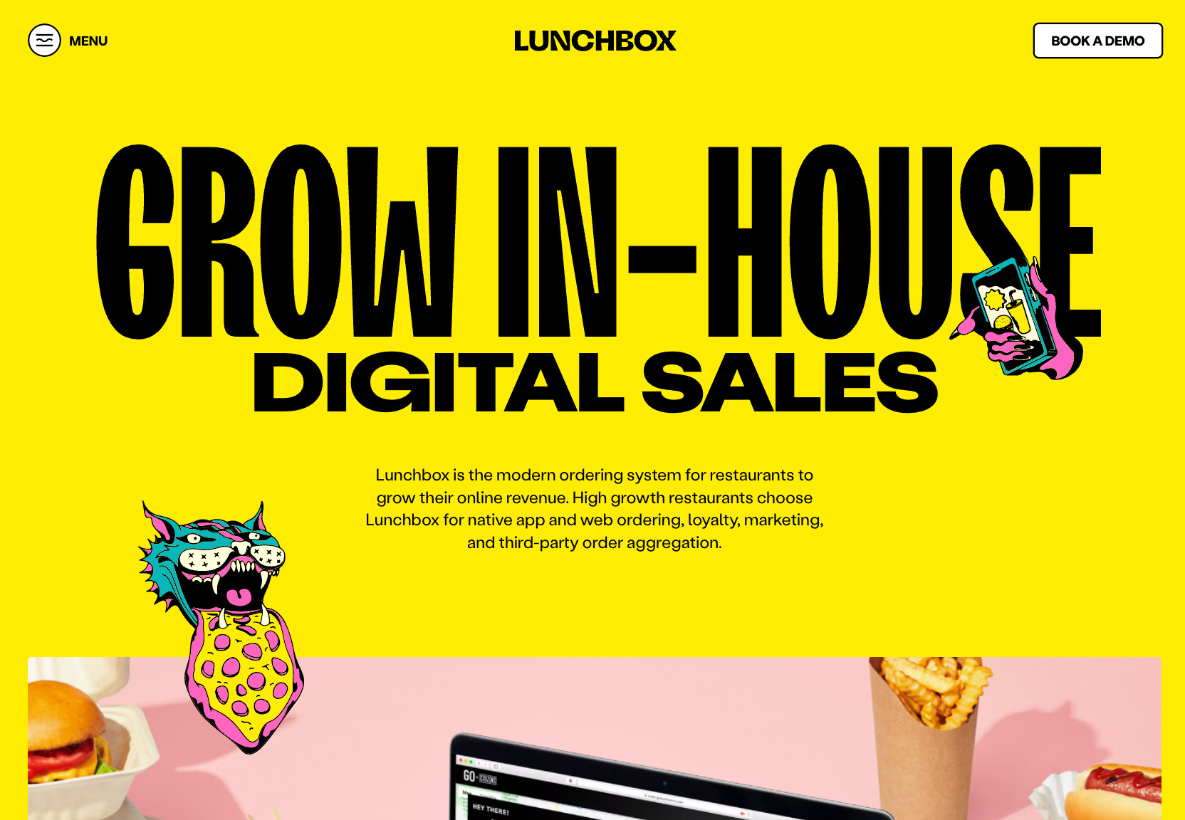
While I wouldn’t personally go with this visual approach to branding, the fact is that they get your attention and stand out – particularly as a B2B brand. If their target customers (which I am not) agree then you’d have to call that a success, at least to some degree.
My main concern would be, are the visuals alienating for my audience? If I were a potential customer, I might feel more comfortable with the buttoned-up looking brand as my technology provider. Then again, Lunchbox’s marketing materials are as clean as they are peculiar – there’s a high level of effort and detail that is put into everything they do, which could mean the same for the products and services they provide.
Finally, to underscore the power of branding, it’s interesting to compare and contrast a company’s marketing/branding at different points in time. With Lunchbox, even if you don’t appreciate their style you have to agree that their 2019 website looks like a generic technology company, while their 2022 website is packed with personality.

Gong
The it factor: colors and tone of voice, particularly in email and social media
Gong is the eccentric, goofy sales bro at the office who talks way too loudly for some reason, but they beat their number every quarter and you like them enough to hang with them at happy hour once every few months.
This personification comes through in many aspects of their marketing, and whether you actually like their style or not you have to respect the uniqueness and consistency of their branding game.

Loud attention-grabbing colors like purple and red.
Caps-lock-ridden broetry posts on LinkedIn.
An automated webchat message from a dog. “Woof.”
It’s not for me, but to be clear I have big-time respect for Gong’s branding because I believe it’s effective.
Salesforce
The it factor: unique and consistent animations and graphics
Several years ago Salesforce went all in on the “Trailblazer” branding – animated outdoor scenes and cute animal characters. In tech we all wish we spent more time outdoors, but since we can’t do that at least we can add outdoorsy visuals to our marketing to make us feel a bit better, right?
This isn’t earth-shatteringly creative branding. But I think it’s worthy of a callout because of Salesforce’s size. As a Fortune 500 company they’ve created a visual style that looks nice, is fairly unique and recognizable, and is a consistent across nearly everything they do.
Slack
The it factor: color styling and sound
The use of rainbow-ish colors is not exactly original, yet every time I glance at something of Slack’s I seem to know it’s theirs before I even see their logo.
And we’ve all heard Slack’s knock brush sound – the company’s unique/default notification sound when you get a new message in their app. If you haven’t heard it before you can play the video below. The sound is a feature of their platform, not a marketing creation. But Slack knows it’s unique, and they’ve done a good job capitalizing on that through their marketing.
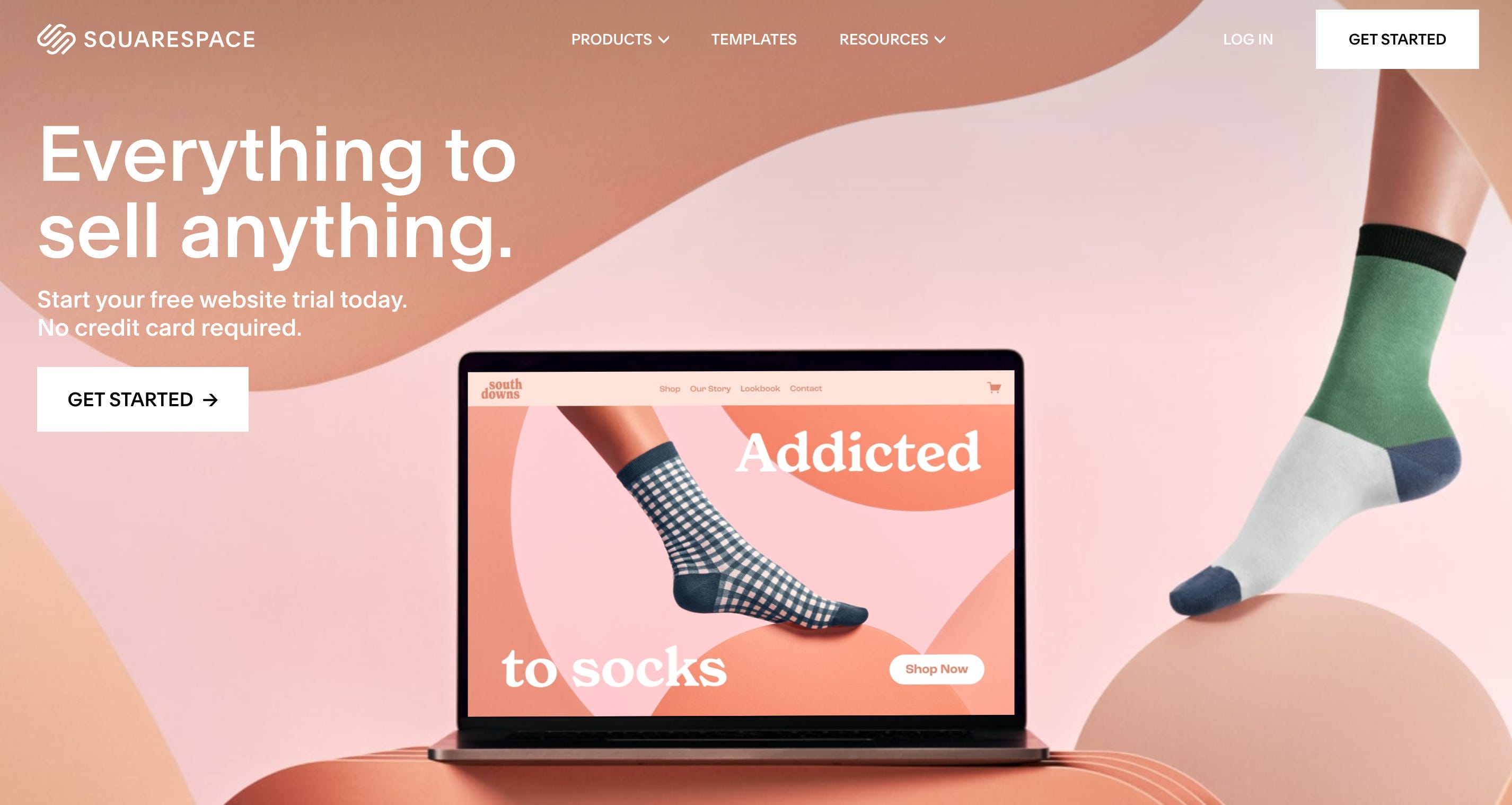
Squarespace
The it factor: relentless use of customer stories
Whenever I’ve considered building/rebuilding a website, either for myself or for my employer, I think of Squarespace. I felt this way back in 2013 at Bizo when we rebuilt our website, and I feel the same way nine years later.
Squarespace always, always highlights the websites of real and made-up customers in everything they do. From the fictional “Sally’s Seashells” featuring Zendaya in their 2022 superbowl ad, to websites of celebrities like Winona Ryder and Keanu Reaves, to made up skin care businesses, their marketing almost always features a story that makes things real – that business websites are built on Squarespace, and yours could be too.
Fascinating example: Squarespace’s website home page. I’m sure they have multiple versions that they a/b test, but the home page that I recently saw showcased a fictional sock manufacturer. But the fictional company isn’t just shown in the laptop mask, most of Squarespace’s home page takes on the branding of this fictional company including the visuals and color scheme. This could risk being very confusing, but I think it’s done quite well. Very meta. Pretty wild.